Caring for patients after the doctors visit
In the age of reviews, social media, and the ‘customer is always right’ people have a high expectation when it comes to the services they are paying for. Healthcare is no exception. I set out to find out what are the pain points people have when it comes to their healthcare, and design a product to address them.
UX Researcher
UX/UI Designer
Role
Process
Competitive Analysis
User Interview
Persona
User Flow
Site Map
Wireframe
Year
Spring 2022

Going to the doctor is expensive and time consuming
Patients that have concerns or questions after an appointment do not have a reliable way to get into contact with their healthcare provider. They have to start the process over, there is no express lane for them. This means making a new appointment, going to the doctors office, and paying another co-fee. Patients need a better way to follow up with their health care provider after an appointment.
Following up with the patients
Once the interviews were complete I compiled the data and made an affinity map. The affinity map allowed me to see what themes were occurring. The participants feedback was split into six categories:
Treatment plan, contacting care team, things we like, things we do not like, feeling cared for, what’s working with billing, what’s not working with billing.
People just want to be heard
The pain points expressed in the user interviews revolved around people not feeling cared for, and the billing process. Due to all the variables involved with medical billing and the time constrains of this project; I opted to address the first pain point and leave billing for a separate project.
Contacting Care Team
• People are not able to get a hold of their doctor and have to speak to nurse or office staff.
• People would like a way to contact their doctor digitally.
• Ability to call or text doctor to ask a quick question.
Billing
• People would like to know how much the medical service is going to cost prior to receiving treatment.
• Multiple people have had experiences of a surprise bill in the mail.
Building a solution that people can easily navigate
Using Optimal Workshop I performed a card sorting exercise with five participants. The sitemap was informed by the card sorting feedback as well as the pain points and user personas.
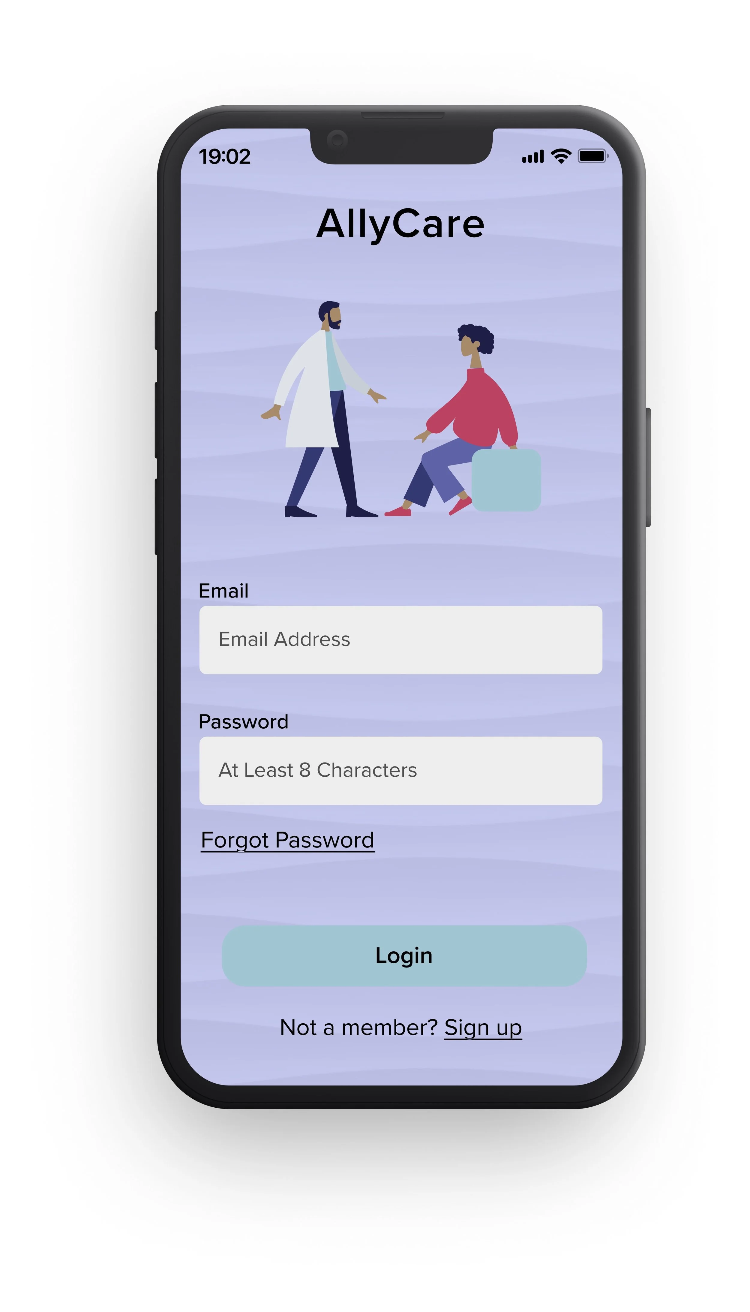
I want people to associate a calm feeling with the website.
I selected a color palette of blues, greens, and purples because they are often associated with calmness, relaxation, and freshness. For the typography I wanted a font that was easy to read on desktop and mobile as well as something that was professional and clean. I looked for fonts that had a tall X and lots of variations with the weight.
Before
The people spoke and we listened
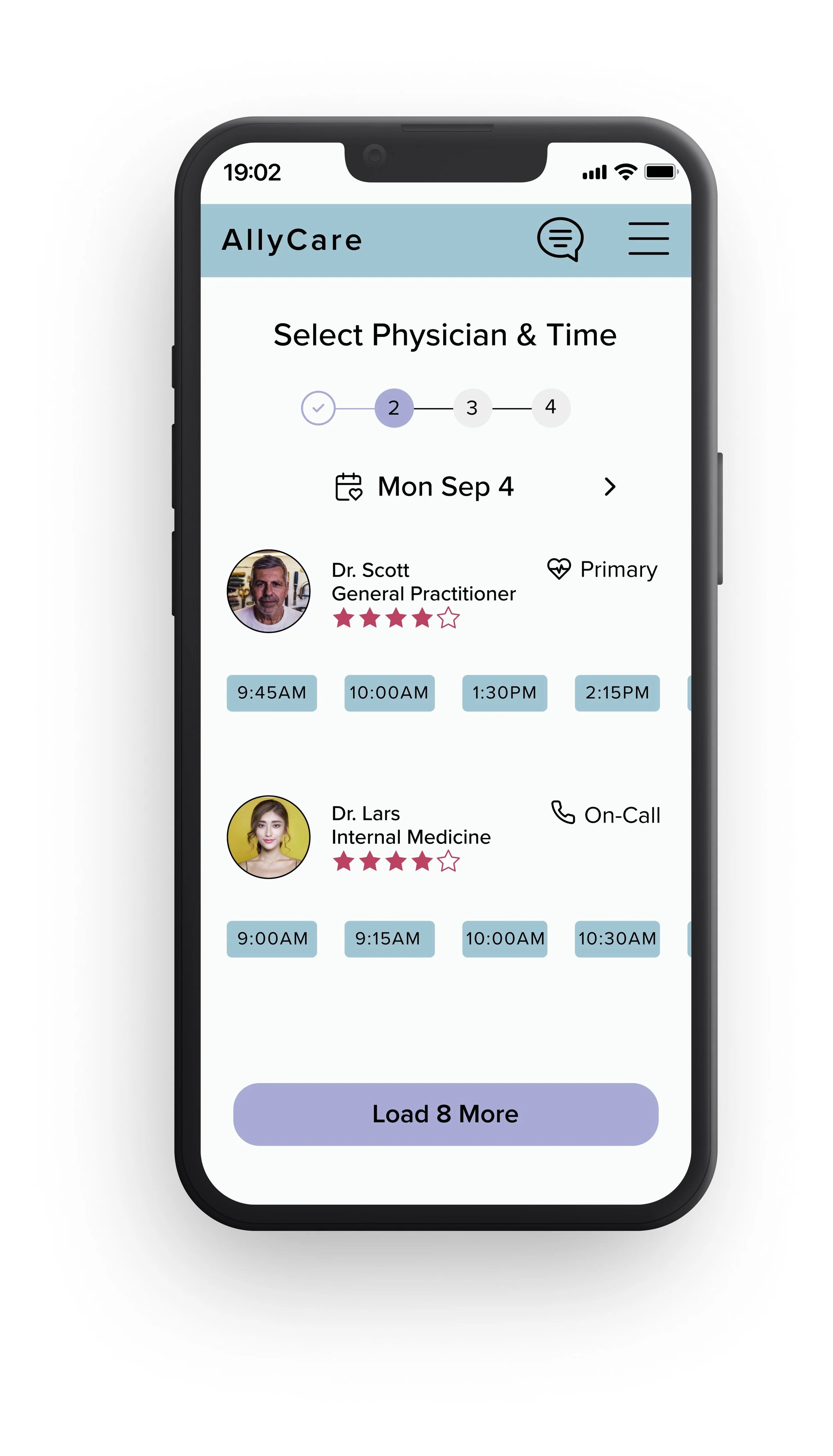
The feedback from the usability testing was implemented below.
Before
Added white background to prevent accessibility issues
Added available appointments
After
After
Added title to Chat icon
Added ‘Last Seen’ date
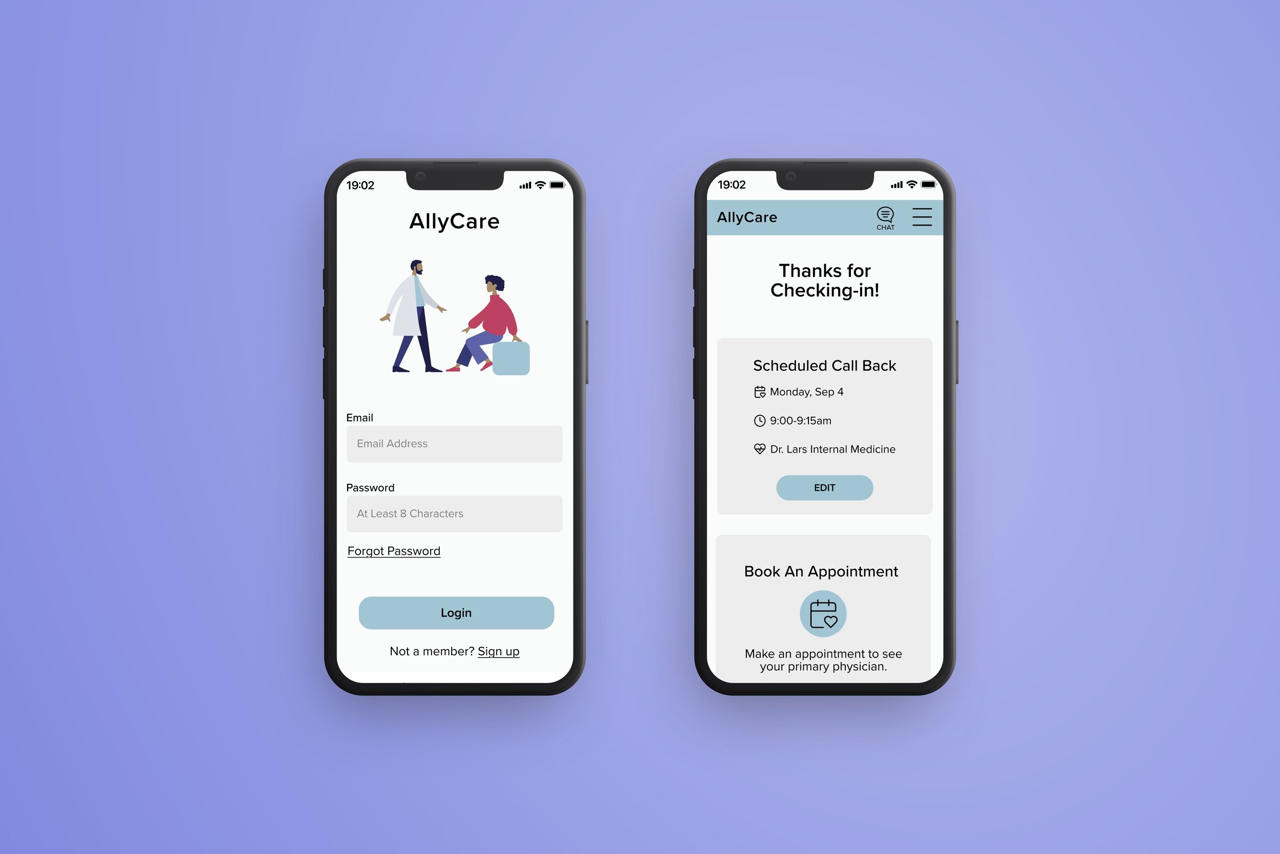
Scheduling a call back
Users have the option to schedule a call back or book an appointment to see a healthcare provider.
Chit Chat
Users are able to chat with a healthcare provider during business hours.


