
Project Overview
For this project I partnered with a local business to reimagine their website. PawBuddy is a pet care business on the Upper East Side of NYC. Prior to working with PawBuddy customers had two ways of booking services: Filling out the ‘Contact Me’ template on the website or leaving a voicemail. Both methods required the customer to wait for a follow up.
Role
UX Researcher
UX & UI Designer
Product
Responsive site
Time
Six weeks

The Problem
The problem that PawBuddy is struggling with is that the process to book their services is time consuming in comparison to their competition.
The Solution
A mobile first approach that customers can use to book services and a website that instills trust in prospective customers.
Rover
-
• Search feature follows common pattern
• CTA on landing page
• Pet Resource center
• Customer Reviews
-
Home page is a little busy
-
• Green color palette
• Font is is kind of wavy/ semi serif
• Great spacing/ use of white space
• Good use of icons
-
• Website or app- User has Login
• Ability to select dog walker
Looking Outward
I researched a few local pet care businesses as well as some of the tech pet care providers like wag and rover for a more wholistic view of the industry. It was interesting to see the different websites for the local businesses and which ones made the transition to allowing clients to book appointments electronically.
Urban Woof
-
• Text spaced out nicely
• Lots of info on process
• Services are listed at top •Book Now CTA
• Webcam available
-
• Color Selection
• Weight of font
• Accessibility issues
-
• Big bold text for headers
• Fuchsia colors
• No icons
• Great spacing/ use of white space
-
Use app- User has login
Bare Paws
-
• Lots of information about process
• FAQ section
• Prices listed out
-
• Color Selection
• Accessibility issues
• Poor hierarchy and spacing
• Big blocks of text on website
-
• Big bold text for headers
• Mustard, Brown, beige color
• No icons
• No real hierarchy
• Poor spacing
-
• Info form that you fill out and submit on website
• Also option to call or text
User Interviews
I interviewed four people over zoom. The first part of the interview focused on their experience with pet sitting services. In the second part of the interview the participants shared their screen and scanned through PawBuddy’s website while I asked them questions.

Allie
Accountant

Sami
Journalist

Sarah
CX Manager

Christine
Student
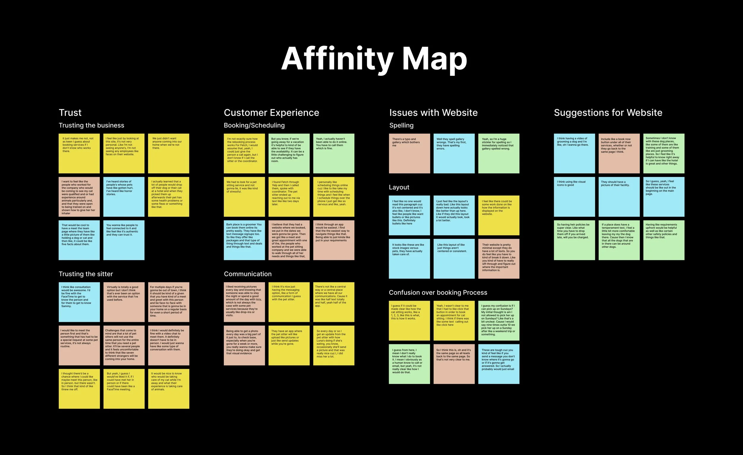
Findings
Trust
• Pet owners would like a consultation with the pet sitter.
• Having customer reviews clearly displayed helps to build trust.
The Pain Points pet owners experienced were finding someone trustworthy and reliable to care for their pet, and a convenient booking process that allows for open communication with the pet care taker. These pain points are reflected in the first two columns below. The third column consists of feedback on PawBuddy’s website in its original state.
Customer EX
• Having the price for each service clearly displayed.
• An open line of communication with the pet sitter
• Appreciate the convenience of an app and mobile booking services.
Website Eval
• Confusion around what services are available, how you schedule services, and how to contact the company.
• Big blocks of text.
• The text and color palette are fun, and they use great photos.
POV & HMW Statement
I formed Point of View (POV) statements with the data from the affinity map. I approached the brainstorming session optimistically about finding potential solutions by coming up with How Might We (HMW) Questions.
How Might We…
• Build trust between pet owners and the pet sitting service?
• Help the pet owner get to know the pet sitter?
• Make scheduling pet sitting less confusing and more streamlined?
Personas
To get a deeper understanding of the users' goals, needs, experiences, and behaviors, two personas were created. They were based on user interviews and surveys.


Inspiration
For some inspiration I walked around the Upper East side and snapped some photos. From there I found some images, patterns, and style guides I liked online for inspiration. I took these raw elements and made some style tiles to show the client.
Neighborhood
Upper East Side
Year
2023


Style Tiles
I made some style tiles to get a feel for how the typography, colors, images, texture and other design elements would come together. It allowed me to get creative and try different things. It was also useful for the client to provide some feedback on which style tile spoke to the branding of their business.


Mid-Fi Wireframes
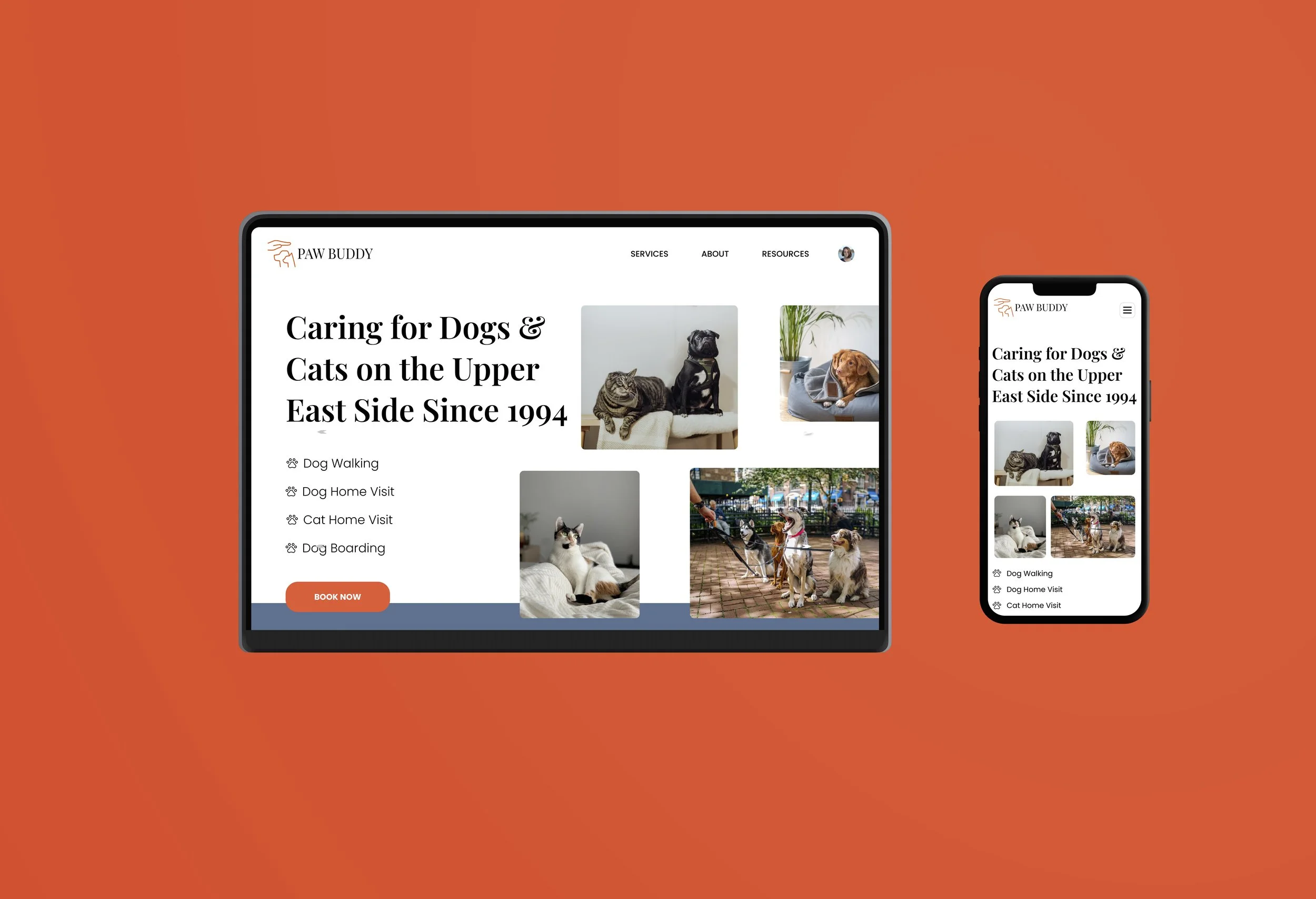
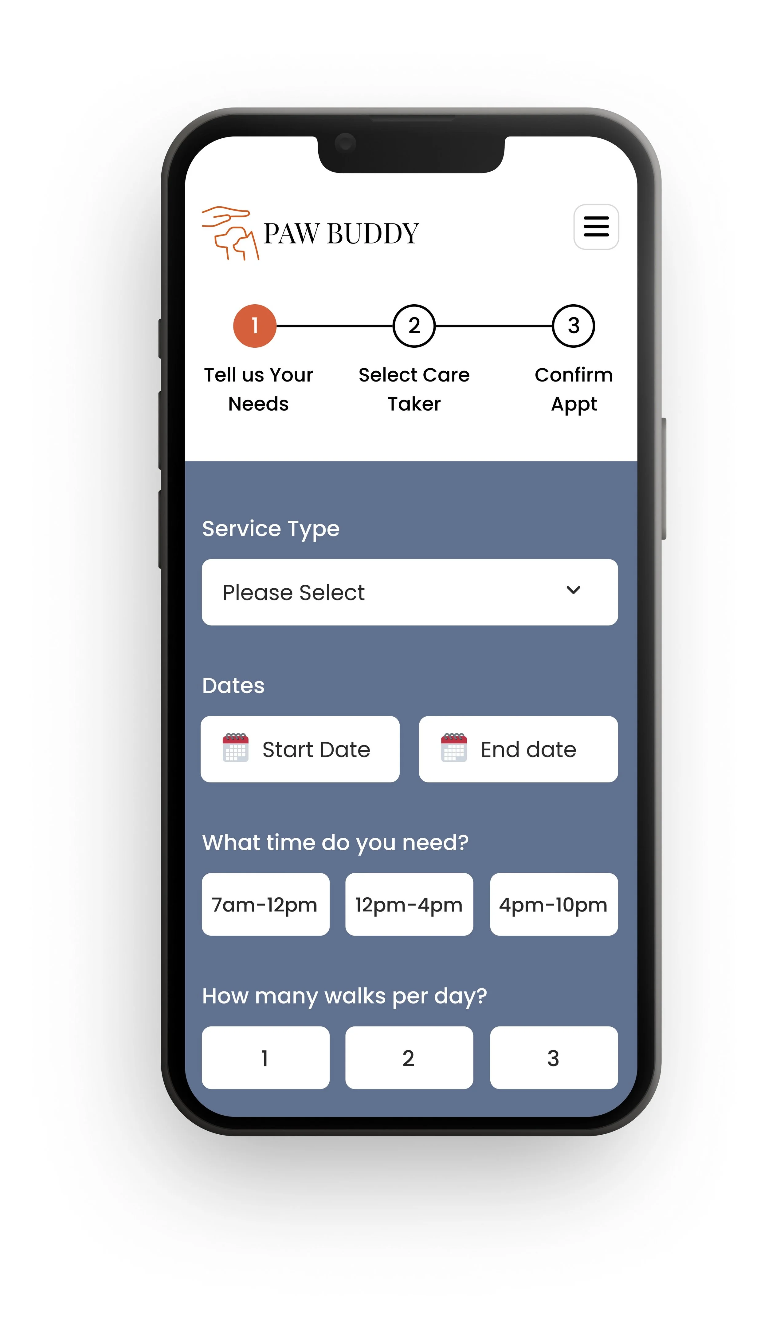
Below are some iterations that I made on the desktop version of the site. You will notice that the navigation and hero section change as I started to get feedback on the user flow. My number one goal was to clearly state the services provided as well as provide the customer’s with a call to action in the hero section. This helped to address the feedback about the site being disorganized and customer’s not knowing where to go.
Version 5

Version 6

Version 7

Solution
The screens below display how I was able to address the customer’s pain points. The Pain Points pet owners experienced were finding someone trustworthy and reliable to care for their pet, and a convenient booking process that allows for open communication with the pet care taker. In addition to that they provided feedback for improvements that could be made on the PawBuddy site.

Pet owners wanted the ability to book online as well as a list of available services

Each care taker has a profile and a video bio. Allowing customer to get to know them and build trust.
Care taker profile displays reviews, which builds customer trust.
Minimized the use of color and increased white space.
Pet owners wanted an opportunity to meet with the pet sitter before booking.


Reflection
This was my first experience working with a client. I definitely felt a sense of responsibility in the success of the business. Being that this was a family owned business people’s livelihood was in play and the gravity of the situation was not lost on me. It was humbling to be able to provide them suggestions that would provide a better customer experience and help to grow the business.
-
• Initially there was a the challenge of determining what mode of communication would be best for everyone. We decided on email as the form of communication because it allowed more room for explanation as well as images and links.
• Logistics: Who would I be communicating with? Who is the decision maker? How often would we meet to discuss how the project was progress? All thing that I had to figure out. Some of these items were discussed and other items just naturally worked themselves out. For instance I started to notice that one stake holder seemed to be more responsive than others, which lead me to engaging that person more often
-
Set clear expectations: I think I could have done a better job of setting the expectation that I would be providing suggestions from a UX/UI perspective and it would be up to the business to decide if they wanted to enact the changes. Also setting expectations around the fact that the business would need to work with a developer to make changes to their website.
-
If this was a freelancing situation and not a project I would have used a hosting platform like Squarespace to build the actual site for the client.
Next Project
AllyCare
