Project Overview
CarDoc is an app that allows car owners to run a diagnostic report and locate a mechanic. After running a diagnostic report the user will get an action plan that informs them of any ongoing issues, the severity of the issue, and the estimated price to repair. With CarDoc in hand car owners will be able to make informed decisions about their car’s maintenance.
Role
UX Researcher
UX/UI Designer
Product
Mobile App
Time
Six weeks

Problemo
Car owners have little information about the inner workings of their car which puts them at risk of driving a car that is unsafe as well as being overcharged when repairing their car.
Winner Winner
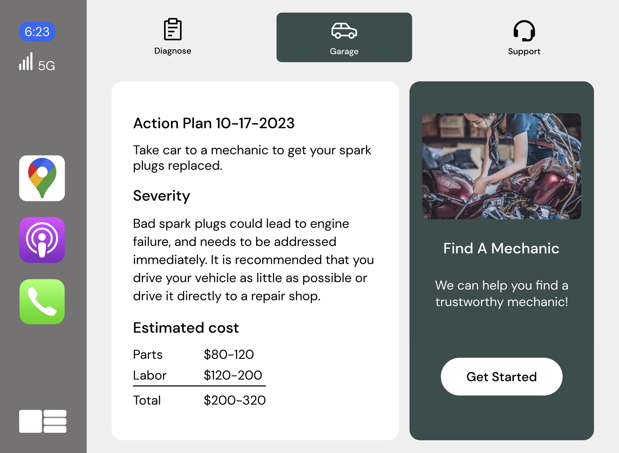
An app that diagnoses any issue that a car is experiencing. After running a diagnostic report the user is provide an action plan to address the issue. The action plan will report on the severity of the issue as well as an estimate of how much it will cost to resolve the issue.
CarDoc in Action
The user flow below shows a user running a diagnostic report, receiving an action plan, finding a mechanic, and sharing the diagnostic report with the mechanic.
Looking Outward
I researched six different automobile related apps. The majority of car apps did not provide users any information about the car’s mechanical issues. That led me to believe that there could be a void in the marketplace that CarDoc could fill.

RIVIAN
-
• Lock and unlock remotely
• Check range and charging status
• Request roadside assistance
-
• Connectivity issues
• Not able to start or stop charging
• Does not integrate with CarPlay

Audi
-
• Info on fuel level, estimated driving range, and oil level
• Schedule a service appointment with preferred dealer
-
• Not able to do remote start
• Notifications about open windows not sent
• Connectivity issues

PlugShare
-
• Interactive- members submit feedback for community
• Link to favorite navigation app for directions to selected charger
-
• Destinations for a trip are deleted without notice
• Charge feature is difficult to use
• Ability to see which charging stations are private vs pubic
And the Survey Says..
The goal of the survey was to get a baseline for what issues car owners were experiencing as well as their knowledge of general car maintenance. The survey results informed some of the questions asked in the user interviews. Below is a snippet of the results.
66% of people are not able to perform basic car maintenance.
66% of people do not know when their car is having issues.
66% of people do not trust mechanics.
Voice of the People
The interviews were conducted remotely over zoom, and on the phone. Below are some of the questions:
• How do you determine or know when your car is having issues?
• When you see an icon light up on your dashboard, what do you do?
• When your car has issues what do you do?
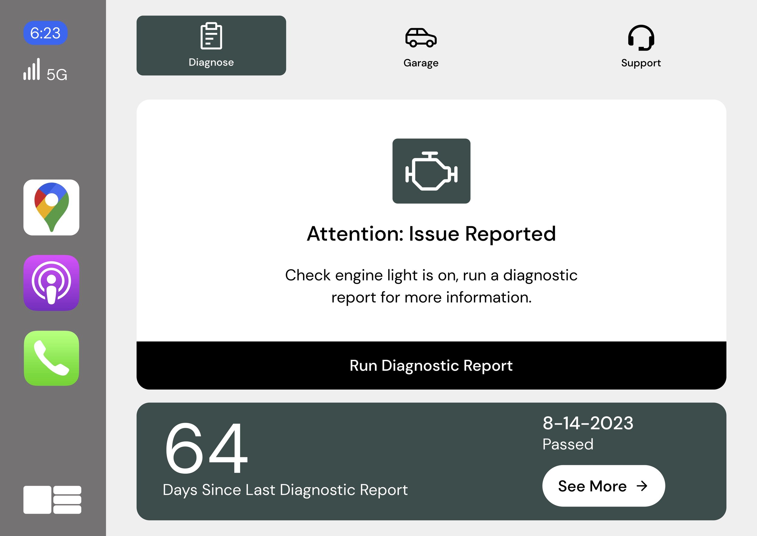
Diagnose
People are not familiar with the scope and severity of the icons they see on their dashboard. This results in people not addressing issues until the situation is severe.

Chris
Animator
Cost
The most stressful part about owning a car is paying for the repairs.

Mike
Sales Director
Carly

Journalist
Findings
The data from the user interviews, surveys, and competitive analysis revealed that users are looking for more information to help them make an informed decision. Below are the three biggest pain points that users experience.
Trust
People are concerned that a mechanic will take advantage of their lack of car knowledge and overcharge them.

Savannah
Social Worker
Personas
The personas were created based on the research participants goals, challenges, and car knowledge. When brainstorming solutions to the users problems the personas were reference several times to ensure I was focusing on the users issues and remaining objective.


Idea Generation
I used the MoSCoW method (Must have, should have, could have, will not have) to help prioritize the features
Must Have
• Car runs a diagnostic report
• Severity of issue & estimate of repair costs
Could Have
• 24/7 access to a mechanic for video calls
• Videos that show users how to check oil level, check tire pressure, & other basic items.
Should Have
• History of service with your car
• Preventive care - Car tells you when you need to change oil, rotate tires, new air filter, etc.
Won’t Have
• Car has ability to listen for strange sounds
• Icon lights up different colors to indicate severity
Storyboard
The Storyboard below shows how the user and the app would interact. I needed to decide if the user would proactively get a message from CarDoc, or would the impetus be on the user to run a diagnostic report on their own timetable. Ultimately, I decided it would be most useful for the app to send the user a notification to run a diagnostic report. That way the user could address any preventative maintenance as well as dormant serous issues.

Branding
After determining how the product would resolve the user pain points I needed to determine what the product would look like. The branding process started with looking at companies in the automotive space that had qualities that I wanted to emulate with my app: Trustworthy, modern, reliable. RIVIAN and Audi were the two companies that provided the most inspiration. RIVIAN was especially helpful when looking at how the infotainment screen was designed, what colors were used, the hierarchy of information, and patterns established.

Solution
The screens below show how I was able to address the user’s pain points. As a reminder the pain points were difficulty in diagnosing car issues, lack of trust for mechanics, and cost.

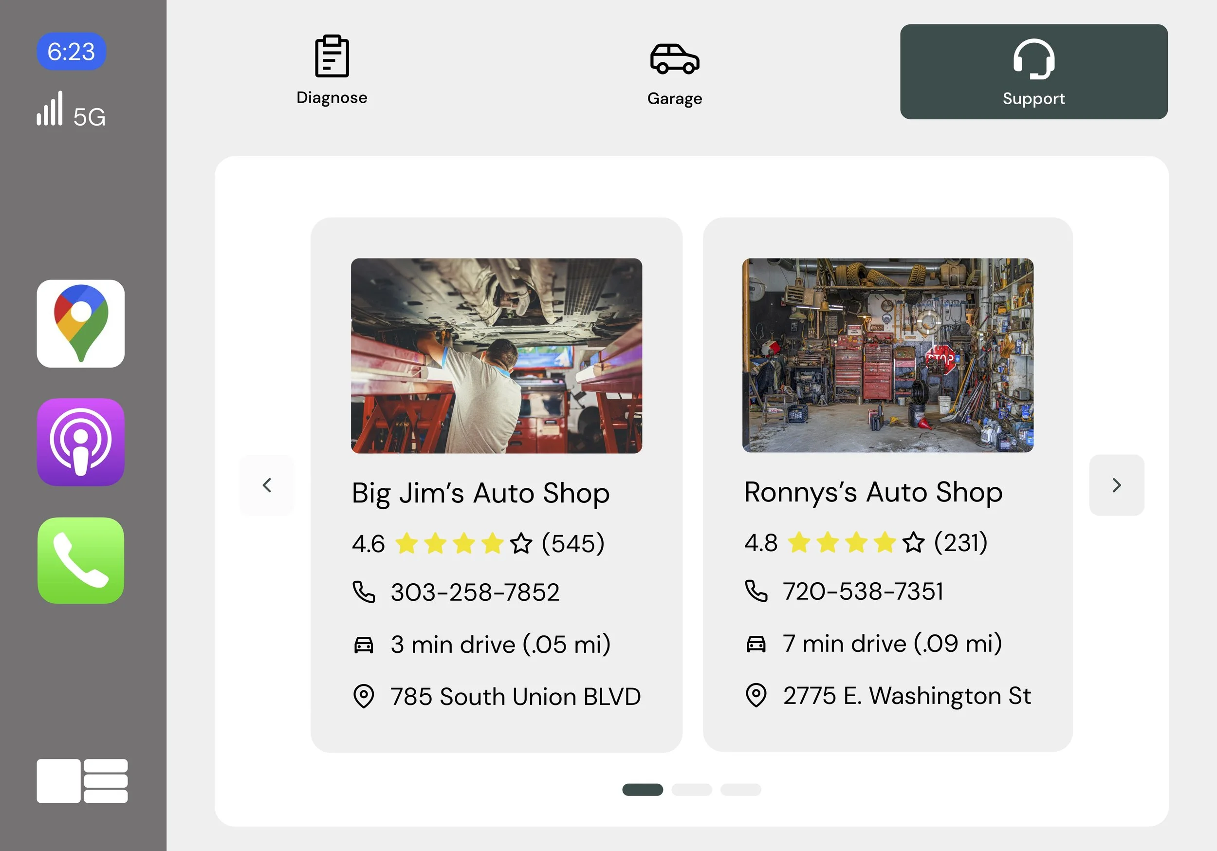
Trust
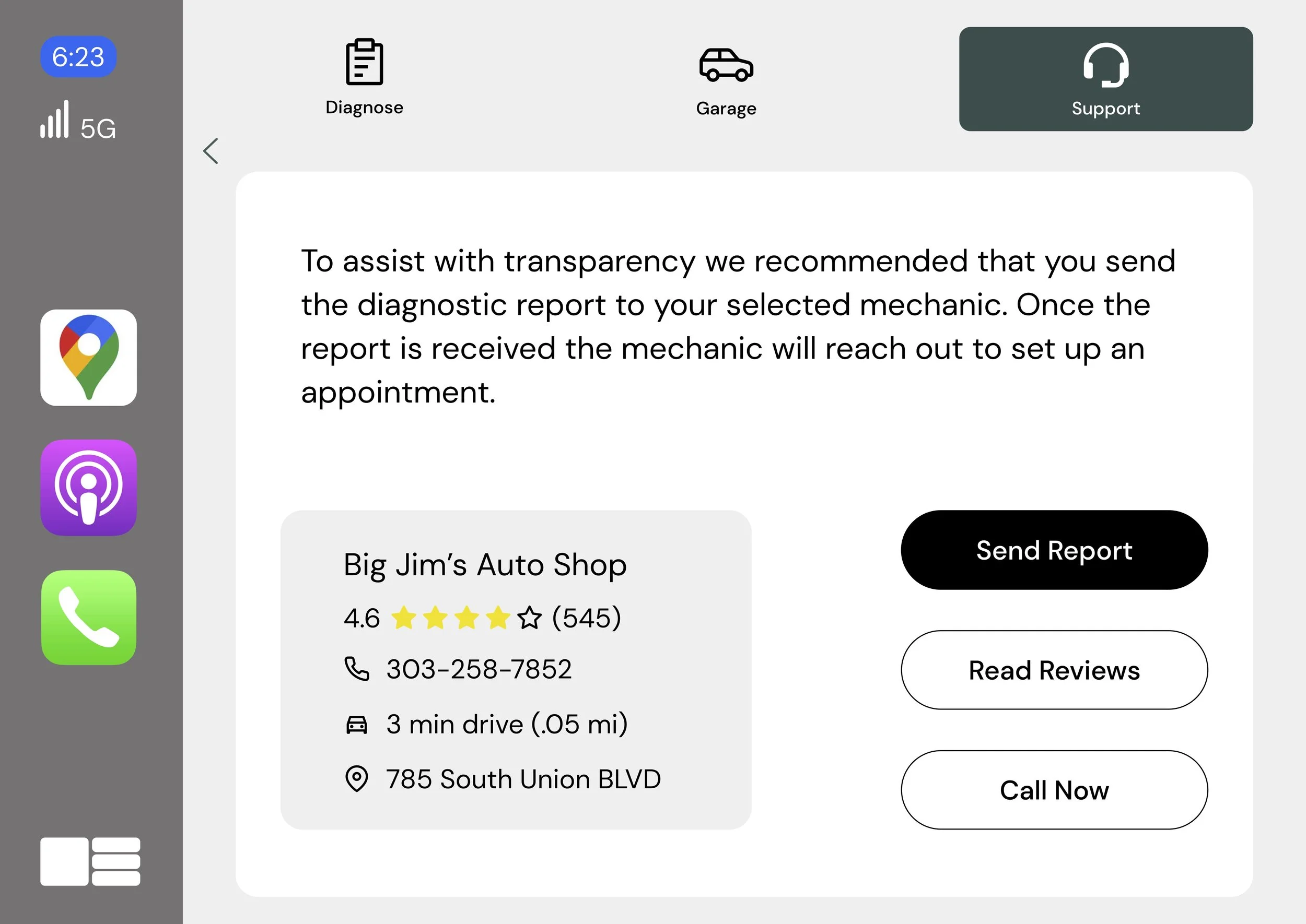
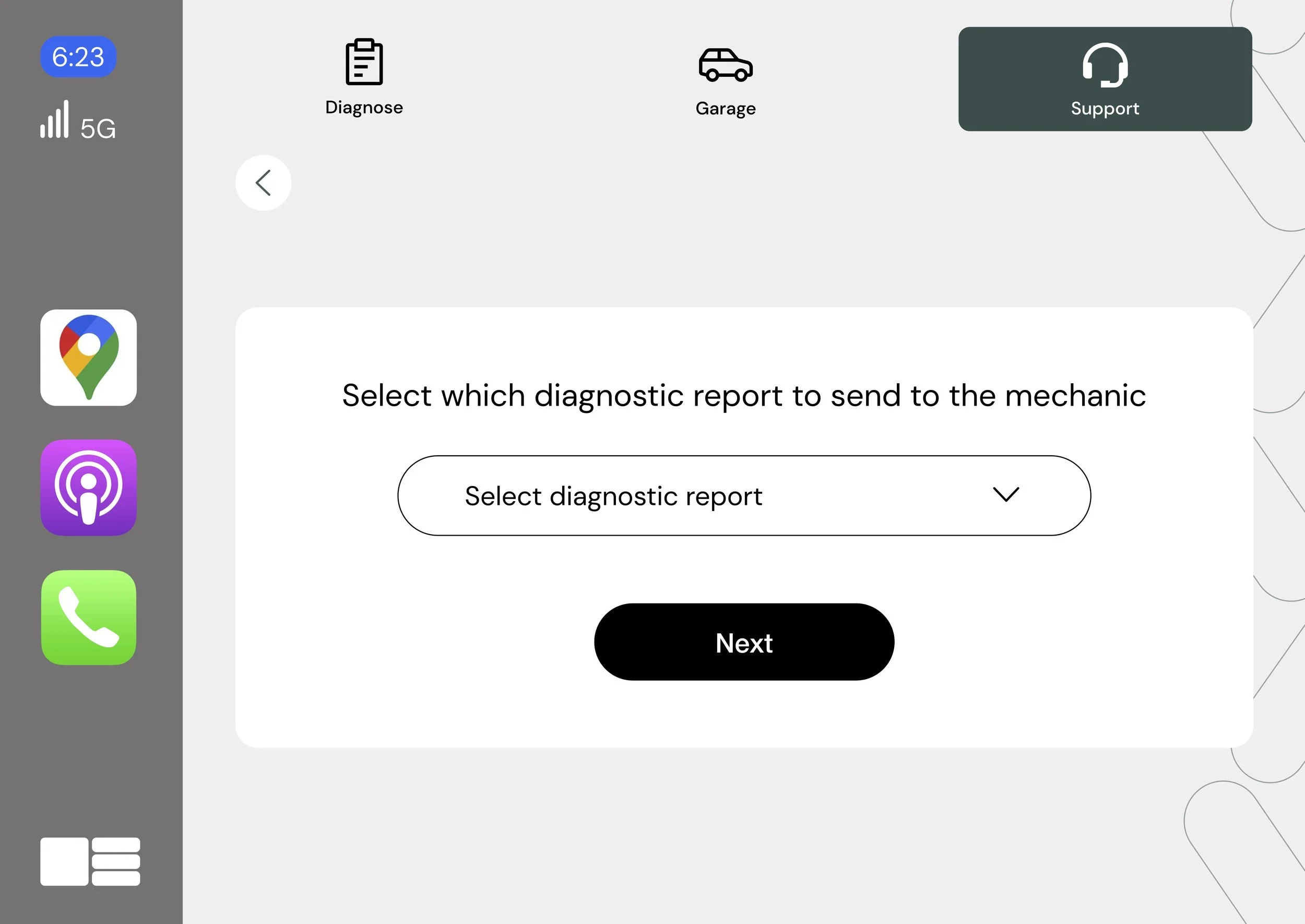
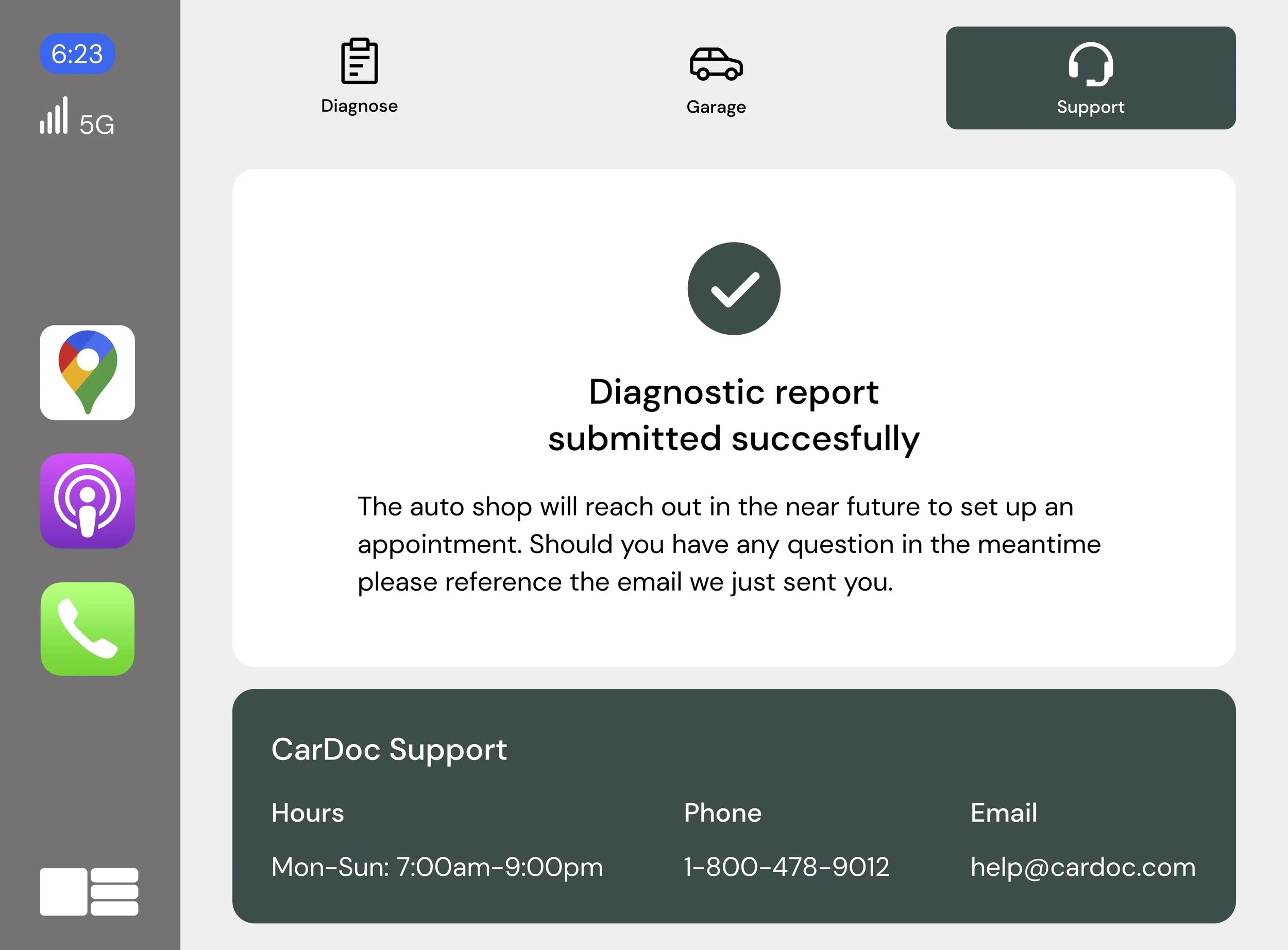
CarDoc helps users find a mechanic in their area. The mechanics all have great reviews. Also CarDoc allows users to send the diagnostic report to the mechanic for full transparency.
Cost
Knowing the estimated cost allows users to make informed decisions about which mechanic to go to. It also provides users with some bargaining power.

Diagnose
Users are informed of the issues their car is experiencing and the severity of said issues.
Hi-Fi Wireframes
For the Hi-Fi frames I toned down the amount of color used. In the earlier versions I used a primary, secondary, and tertiary color palette. Users found the use of color to be distracting.


Reflection
My favorite part about this project was the meeting of UI and UX. Analyzing the site map, task flow, and storyboard to try and figure out what screens I needed to design to allow the user to accomplish their goal.
-
One of the big challenges was whether I wanted the user flow to include mobile. I ultimately decided to exclude mobile because the diagnostic report has to be completed on the infotainment screen in the car.
Another challenge was how to have the app be informational without feeling like an educational app. To do this I removed the learning section, FAQ section, and pared down the information to just the essentials.
-
I thought the user would be interested in learning more about the way their car functions, and historical information about the service history of their car. However, research showed that the user was more interested in what was happening with their car in that moment.
The design process is not linear. In this project I found myself going back to earlier design decision I made and changing items. The best example of that is the sitemap. The earlier versions of the sitemap was much denser than the parred down final version.
-
For next steps I would start designing a mobile version of the app. I would need to do some additional user interviews to see what features would be useful for the mobile version of the app.
I would also like to add additional features when it comes to support. For instance one idea that came up was a live video call with an expert.
Next Project
IKEA App